After you’ve defined the validation logic for your entities and performed validation automatically or manually, you want to show the aggregated validation messages on the UI. Unfortunately WinRT/XAML doesn’t come with such a functionality out of the box and solutions like Prism for Windows Runtime don’t add much value here as well.
WinRT XAML Validation library to the rescue: it comes with two handy UI controls ValidationPanel and ValidationSummary that give you a generic and easy-to-use approach to show validation messages to the user.
ValidationPanel
The ValidationPanel control can be used to show validation information for a single property of your data model entity. It can be wrapped around any XAML control (e.g. a TextBox) and has the following abilities:
- Show a red/yellow border around the control to represent Errors/Warnings.
- Show all validation messages for a property at the bottom of the control (optionally).
The usage of the ValidationPanel is quite simple. In XAML, just wrap it around a normal UI control and bind the ValidationMessages collection with the corresponding entity property as key to the control’s ValidationSource property:
<Page x:Class="WinRTXAMLValidation.Demo.MainPage" ...
      xmlns:vc="using:WinRTXAMLValidation.Library.Controls">
    ...
    <TextBlock Text="Your bid" />
    <vc:ValidationPanel ValidationSource="{Binding Bid.ValidationMessages[NewBid]}">
        <TextBox Text="{Binding Bid.NewBid, Mode=TwoWay}" />
    </vc:ValidationPanel>
</Page>
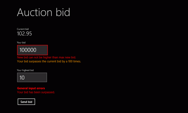
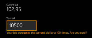
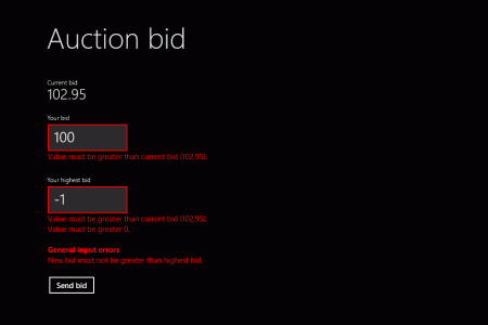
Here’s a sample output of two ValidationPanel controls, showing warnings and errors for the wrapped user inputs:
There are several properties on ValidationPanel that define its behavior:
ValidationSource: Bind anyReadOnlyCollection<ValidationMessage>to this property and the control will display the corresponding validation messages (Errors/Warnings). Normally binds toValidationBindableBase.ValidationMessages[<PropertyName>].ShowValidationMessages(default:true): Indicates whether the validation message texts will be shown on the control. Otherwise, only a red/orange border will be drawn on error/warning validation messages.ShowPropertyValidationMessages(default:true): Indicates whether simple validation messages for a property (identified byValidationMessage.ValidationMessageKind.Property) will be shown as text at the control.ShowGroupValidationMessages(default:true): Indicates whether property-group validation messages (identified byValidationMessage.ValidationMessageKind.Overall) will be shown as text at the control. This can come in handy if you don’t want to use theValidationPanelfor validation messages that span several properties, but show them in the aggregatingValidationSummaryinstead.
If you’ve used manual validation with a fake entity that stores the validation messages for you, you can bind the fake entity to ValidationPanel and your data model entity to the wrapped control as before:
<vc:ValidationPanel ValidationSource="{Binding BidValidation.ValidationMessages[NewBid]}">
    <TextBox Text="{Binding Bid.NewBid, Mode=TwoWay}" />
</vc:ValidationPanel>
ValidationSummary
The second control of the WinRT XAML Validation library is the ValidationSummary. While the ValidationPanel can be used to show validation messages for a single property, the ValidationSummary is there to show all aggregated validation messages of an entity.
Usage of the ValidationSummary is very easy. Just bind its ValidationSource property to ValidationBindableBase.ValidationMessages.AllMessages, if your entity derives from ValidationBindableBase. Moreover, you can use any ReadOnlyDictionary<string, ReadOnlyCollection<ValidationMessage>> of validation messages for the properties of an entity and bind it to the control. Here’s a simple code example:
<Page x:Class="WinRTXAMLValidation.Demo.MainPage" ...
      xmlns:vc="using:WinRTXAMLValidation.Library.Controls">
    ...
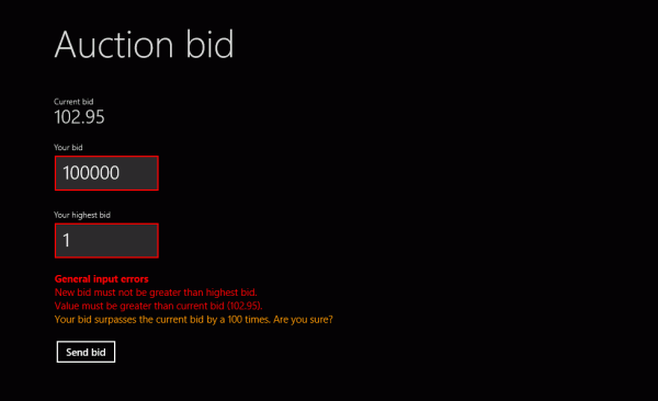
    <vc:ValidationSummary ValidationSource="{Binding Bid.ValidationMessages.AllMessages}" Header="General input errors" />
</Page>
The following picture shows a sample output of the ValidationSummary for a validated entity, including errors and warnings.
There are several properties of the control that can be used to define its behavior:
ValidationSource: Dictionary of validation messages that should be shown in the summary. Normally binds toValidationBindableBase.ValidationMessages.AllMessages.ShowPropertyValidationMessages(default:true): Indicates whether validation messages for single properties should be shown in the summary or not.ShowGroupValidationMessages(default:true): Indicates whether validation messages for property groups should be shown in the summary or not. This can come in handy, if you want to show this information only inValidationPanel, but not in theValidationSummary.AffectedPropertyNames: Collection of property names, whose validation messages should be shown in the summary. If no value is given, the validation messages for all properties will be shown.Header: Header text to be shown above the summary. If no value is given, no header will be shown.ShowHeader(default:true): Indicates whether a header will be shown above the summary or not.

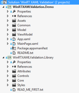
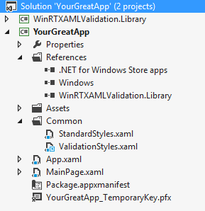 To use the WinRT XAML Validation library, you have two possibilities. The first one is to include the library sources. To do this, copy the
 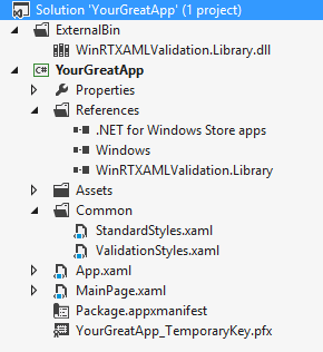 If you don’t want to include the library’s sources to your solution, you can just add the compiled assembly as reference. To do this, first compile the WinRT XAML Validation library as Debug or Release. Copy the output assembly to your solution and reference it in every project where you want to use the validation functionality.

